UI changes to improve spell scrolls, inventory, etc.
Let me preface this by saying that there are a lot of game-breaking bugs right now, and so I'd rather see Pierre fix those issues first before moving on to general UI improvements.
That said, there are a few relatively minor UI fixes that I think could take some of the confusion/annoyance out of gameplay.
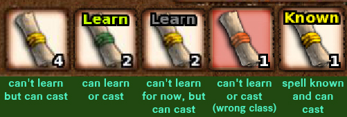
1) Spells that you can eventually learn, but don't have the correct level for yet, should be marked with a greyed out "Learn." (see example below)
This is an extremely simple fix that will eliminate a ton of confusion, since it's almost impossible to tell which spells are ones you can learn later, and which ones you can cast from but can't learn (because they don't belong to your class or whatever)
2) Right-clicking on a spell scroll should show more useful information in the Item Details.
This should include the spell's base level, what classes can learn from the scroll, which classes can cast from the scroll, the spell class (ex: Evocation) and ideally also include all the information that you would normally see on the help page for that spell.
If this can't be done due to the way items are handled (somehow the spell scroll description can't be changed to reflect individual items) then at the very least, the spell scroll name should be appended to include the class(es) and base level so we don't have to guess.
3) Update the spell page to show (greyed out) the spells that the player doesn't know, as well as preview (also greyed out) what spells exist in levels they don't have yet.
This ties into the above, where it's annoying trying to manage your inventory and figure out what spells a character can learn, what spells they have or are missing, etc. Adding the greyed-out "Learn" to scrolls would fix a lot of that, but it still won't tell you which scrolls you should go shopping for because one or more of your characters has an important gap in their spell library.
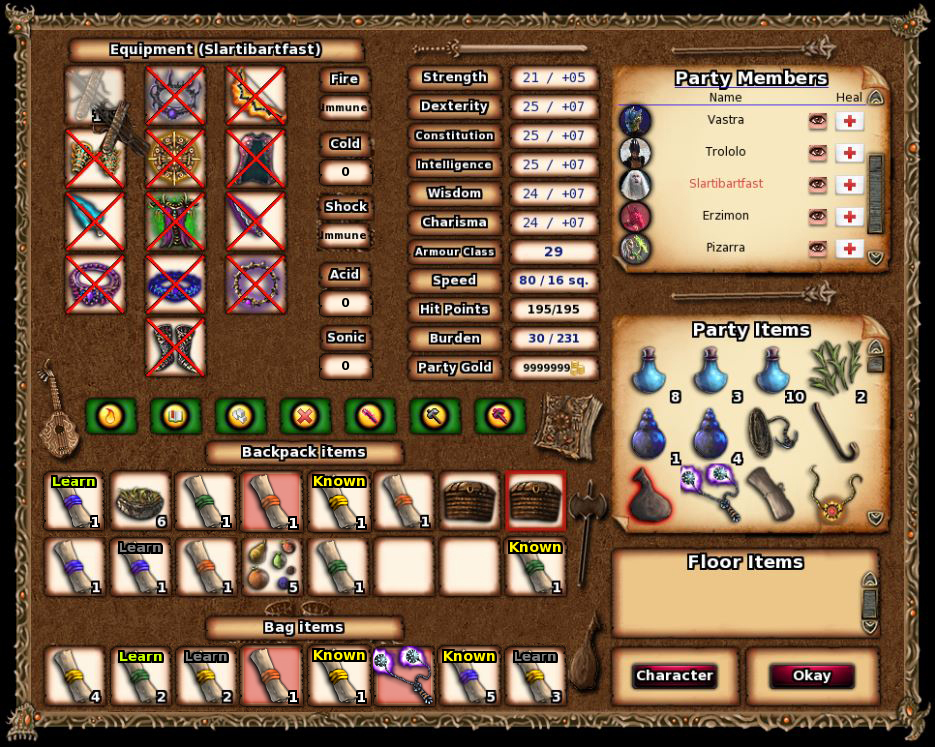
4) The bag/chest inventory row badly needs to be overhauled. First and foremost, if you have a weapon, armor, or spell scrolls in a chest or bag, you should be able to see which ones you can equip/learn from while it's inside the bag. (And those in-bag spells should appear as green "you already have" on the level-up screen, which seems to be rather inconsistent about whether or not it recognizes bag stock.)
5) If you have a bag or chest, the bag inventory should be always open and the contents displayed as a permanent 3rd row. If you have multiple, it should either default to the first chest that it sees, and toggle views when you click on another container item, or turn into a scroll window to allow as many rows as you have bags.
To make this possible, the range weapon/range ammo slots, and Fire, Cold, Shock, Acid, Sonic resistances should be relocated as shown below so that the bag row(s) can be displayed without fear of covering that information up.
That said, there are a few relatively minor UI fixes that I think could take some of the confusion/annoyance out of gameplay.
1) Spells that you can eventually learn, but don't have the correct level for yet, should be marked with a greyed out "Learn." (see example below)
This is an extremely simple fix that will eliminate a ton of confusion, since it's almost impossible to tell which spells are ones you can learn later, and which ones you can cast from but can't learn (because they don't belong to your class or whatever)
2) Right-clicking on a spell scroll should show more useful information in the Item Details.
This should include the spell's base level, what classes can learn from the scroll, which classes can cast from the scroll, the spell class (ex: Evocation) and ideally also include all the information that you would normally see on the help page for that spell.
If this can't be done due to the way items are handled (somehow the spell scroll description can't be changed to reflect individual items) then at the very least, the spell scroll name should be appended to include the class(es) and base level so we don't have to guess.
3) Update the spell page to show (greyed out) the spells that the player doesn't know, as well as preview (also greyed out) what spells exist in levels they don't have yet.
This ties into the above, where it's annoying trying to manage your inventory and figure out what spells a character can learn, what spells they have or are missing, etc. Adding the greyed-out "Learn" to scrolls would fix a lot of that, but it still won't tell you which scrolls you should go shopping for because one or more of your characters has an important gap in their spell library.
4) The bag/chest inventory row badly needs to be overhauled. First and foremost, if you have a weapon, armor, or spell scrolls in a chest or bag, you should be able to see which ones you can equip/learn from while it's inside the bag. (And those in-bag spells should appear as green "you already have" on the level-up screen, which seems to be rather inconsistent about whether or not it recognizes bag stock.)
5) If you have a bag or chest, the bag inventory should be always open and the contents displayed as a permanent 3rd row. If you have multiple, it should either default to the first chest that it sees, and toggle views when you click on another container item, or turn into a scroll window to allow as many rows as you have bags.
To make this possible, the range weapon/range ammo slots, and Fire, Cold, Shock, Acid, Sonic resistances should be relocated as shown below so that the bag row(s) can be displayed without fear of covering that information up.